Inter-Dealer Transfer Management System
Read time:
7 min
Client:
Fundserv
Industry:
Finance
Start:
End:
Duration:
12 Weeks
Project Overview
Fundserv is the indispensable connectivity hub for the Canadian investment industry. Headquartered in Toronto, they electronically connect Manufacturers, Distributors, and Intermediaries, enabling them to buy, sell, and transfer investment funds. With over 30 years of service excellence and up to 120 million yearly network transactions, Fundserv is the backbone of how Canada's investment industry moves.
As part of a strategic initiative to modernize their network, Fundserv set out to digitize one of the industry's most friction-heavy processes: inter-dealer fund transfers. I joined as the sole UX designer to design the MVP platform that would make that possible.
My Role
I led end-to-end UX design as the sole designer on the team, working closely with a Product Manager, a Project Manager, and the development team. My responsibilities spanned research, synthesis, flow design, wireframing, and prototyping through to final handoff.

The Challenge &
My Approach
The Challenge
When a client moves their investment portfolio from one financial institution to another, two parties are involved: the Relinquishing Dealer (who holds the assets) and the Receiving Dealer (who will take them on). The handoff between these two parties required exchanging documents back and forth manually, with no shared system, no status tracking, and no single source of truth.
The result? Endless back-and-forth emails, version confusion, missed approvals, and delays that frustrated everyone involved. There was no way for either party to see where a transfer stood, and no audit trail if something went wrong.
Fundserv needed a platform that could bring both sides of this relationship into one unified workflow.
My Approach
I started by understanding how dealers were currently managing transfers, where the communication was breaking down, and what made the document exchange feel slow or unreliable. I spoke with stakeholders and dealer-side users to understand their day-to-day pain points, decision points, and the moments where delays or confusion typically happened.
From there, I mapped the end-to-end workflow and designed a dashboard experience that gave both parties a shared view of transfer progress, responsibilities, and required actions. I tested and refined the flow multiple times to make the document exchange feel more seamless, reduce back-and-forth communication, and create a smoother handoff between the Receiving Dealer and Relinquishing Dealer.
Research & Key Insights
I started by conducting one-on-one user interviews to understand how dealers were currently navigating the transfer process. The conversations quickly revealed a shared frustration: the process wasn't just slow, it was structurally unclear. Neither side had a confident picture of what was needed, what had been sent, or what was still outstanding.
From these interviews, I built user personas and storyboards to map out the lived experience of both the Receiving and Relinquishing Dealer roles. This helped the team align on who we were designing for and what "done" actually looked like from each perspective.
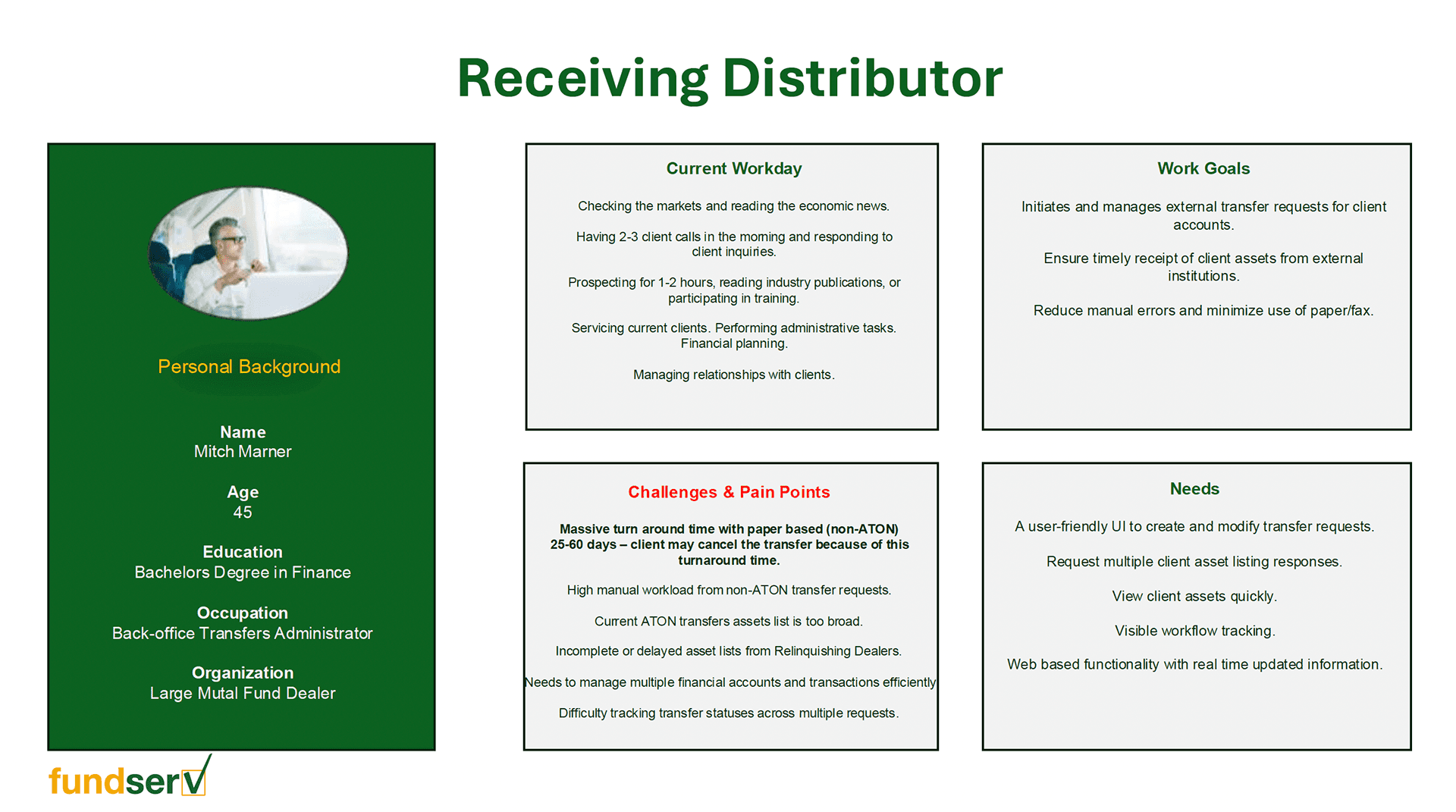
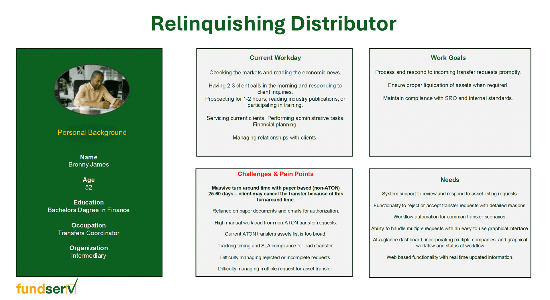
User Personas
To design for both sides of the transfer process, I first needed to understand who I was designing for. Based on insights gathered from user interviews, I crafted personas representing the Relinquishing and Receiving Dealer roles, capturing their goals, frustrations, and the context in which they work. These personas kept the team grounded in real user needs throughout every design decision.
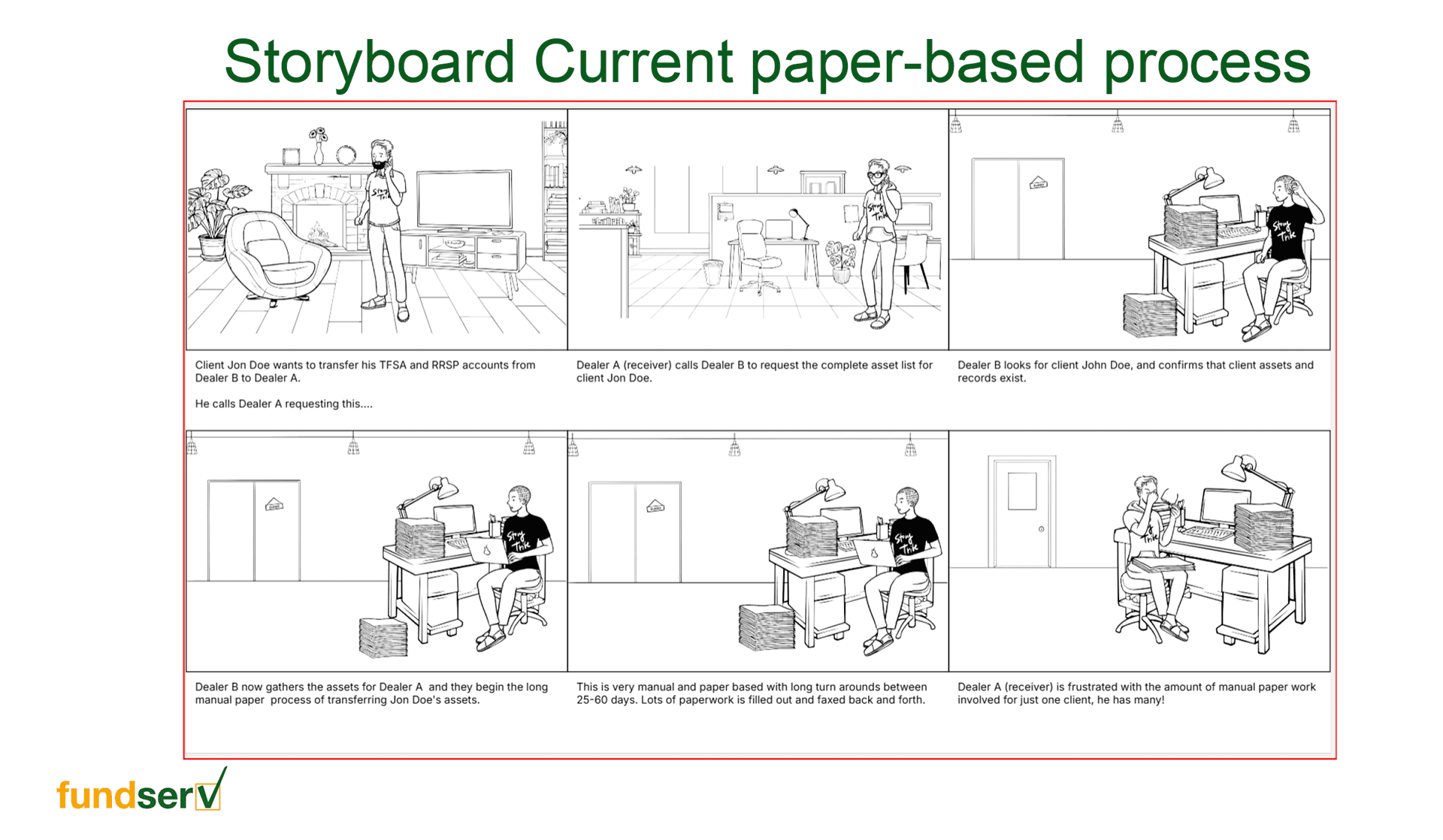
Storyboard
I mapped out the reality users were living with. This storyboard follows the paper-based transfer process from start to finish, the phone calls, the emails, the documents sent back and forth, the waiting. Visualizing the current state made the pain points impossible to ignore: too many handoffs, too little visibility, and too much room for things to fall through the cracks. It set the stage for why change was necessary.
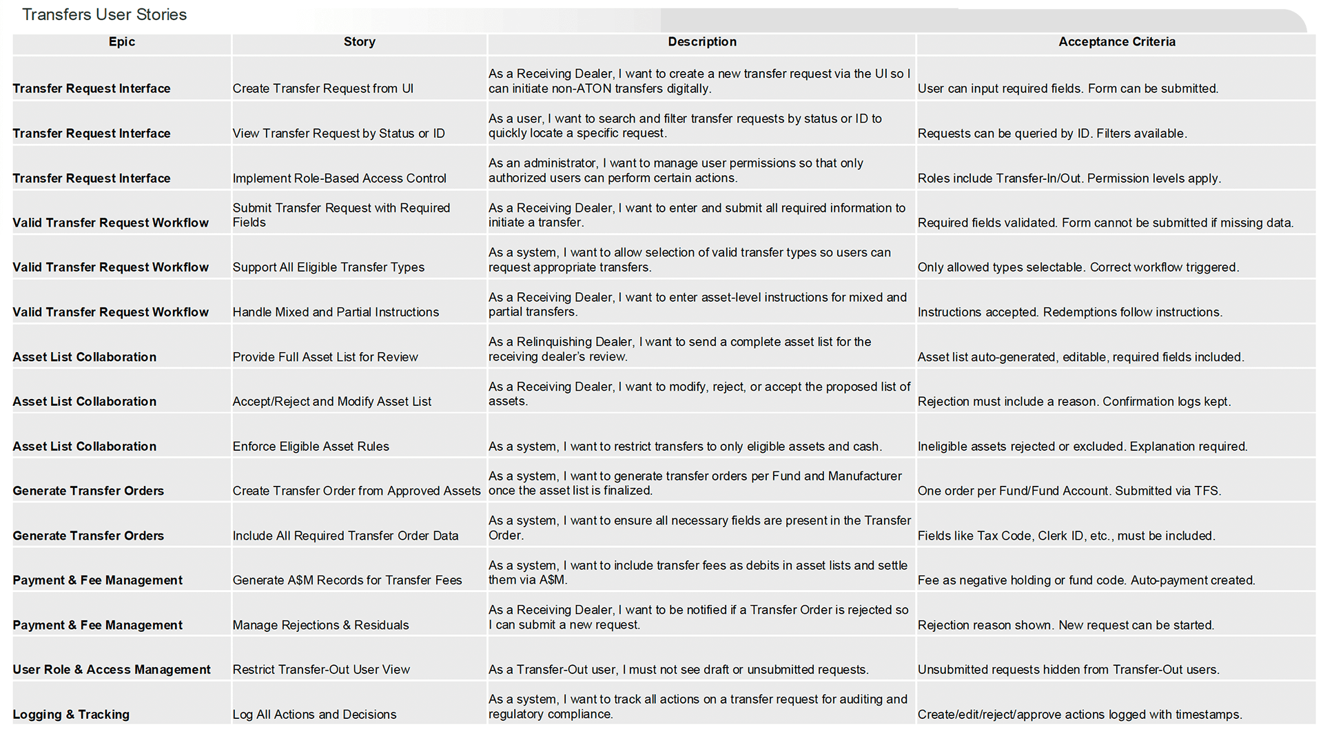
User Stories
With the personas defined, I translated their needs into user stories to map out what each role needed to accomplish within the platform. This exercise was especially important given the symmetrical nature of the product, every action on one side has a corresponding reaction on the other. The user stories became a shared language between design, product, and development, ensuring nothing fell through the cracks.
Strategy & Design Process
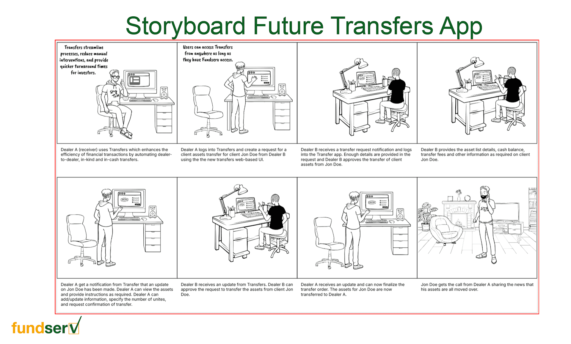
New Storyboard
This storyboard tells the same story, but the way it should be. The same transfer journey, now handled entirely within the Fundserv Transfer platform. Both dealers work from a single shared space: requests are initiated digitally, asset lists are reviewed and approved in-platform, and status is visible at every step. Putting the two storyboards side by side made the value of the product immediately clear to stakeholders, not just as a feature list, but as a genuine improvement to people's working lives.
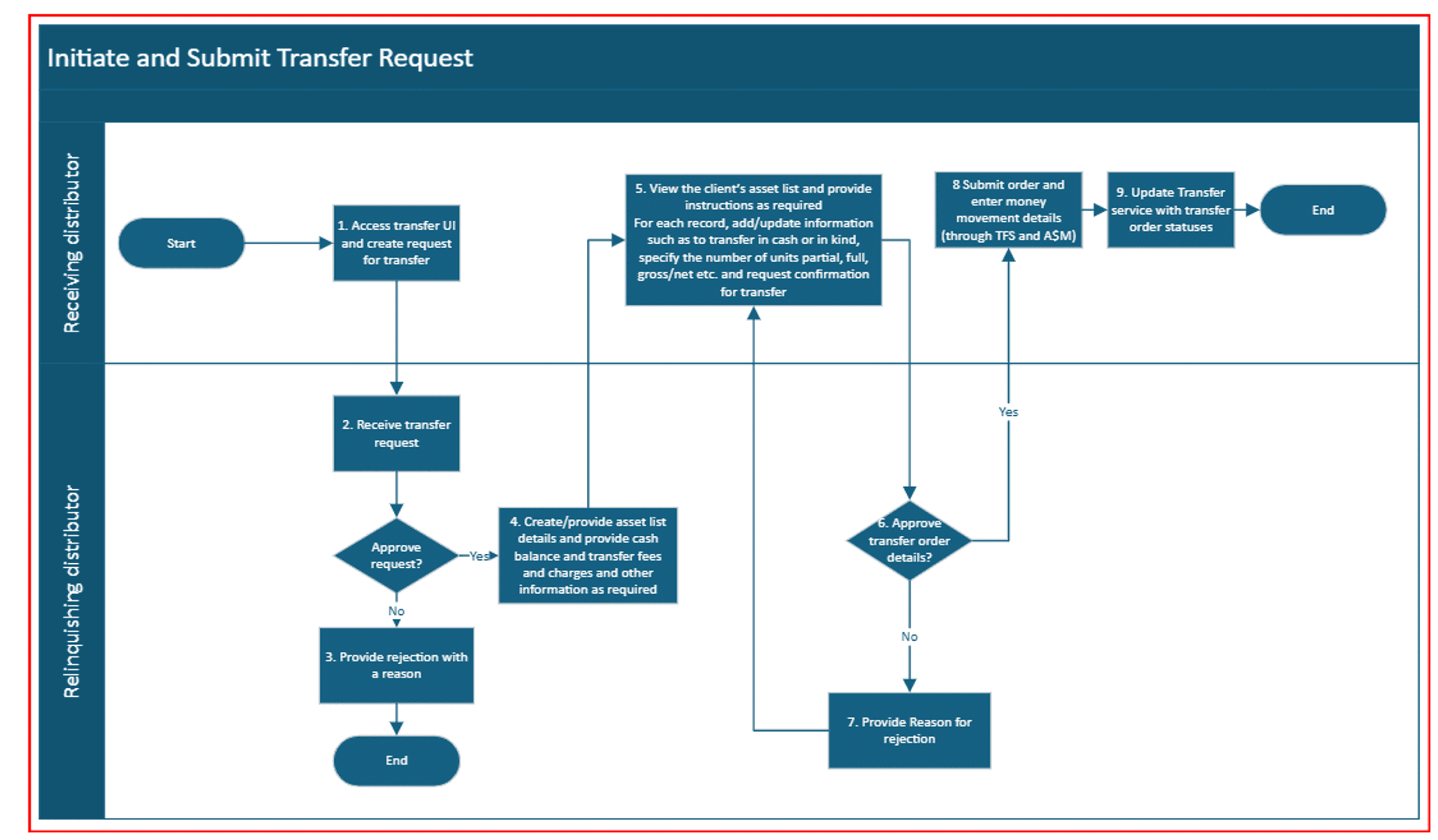
User Flow
With a clear picture of both user roles and their needs, I mapped out the complete user flow for the Transfers Platform. This diagram traces every path a user can take, from logging in and initiating a transfer request, through asset list exchanges, document reviews, and approvals, all the way to final confirmation. Designing the flow for two distinct roles simultaneously was the key challenge here: the handoffs between the Relinquishing and Receiving Dealer had to feel seamless on both ends. Every decision point was carefully considered to minimize confusion and keep users moving forward with confidence.
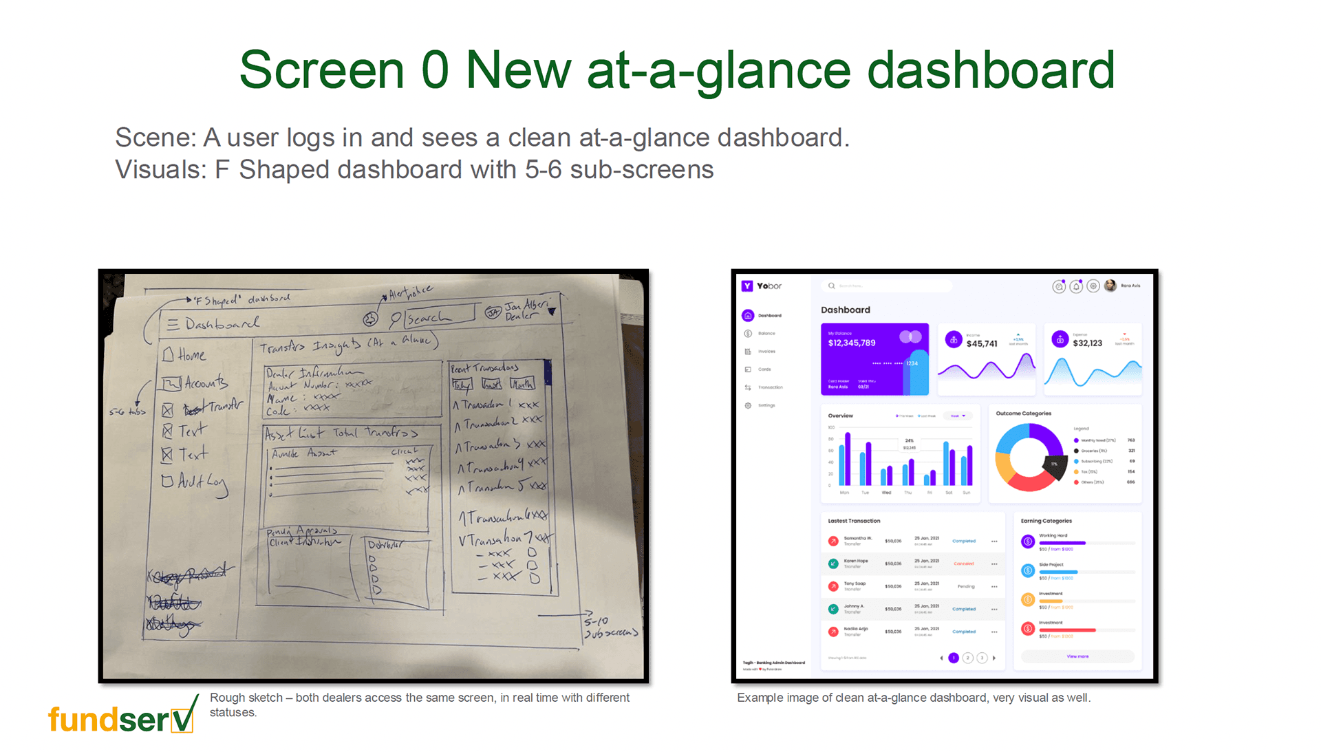
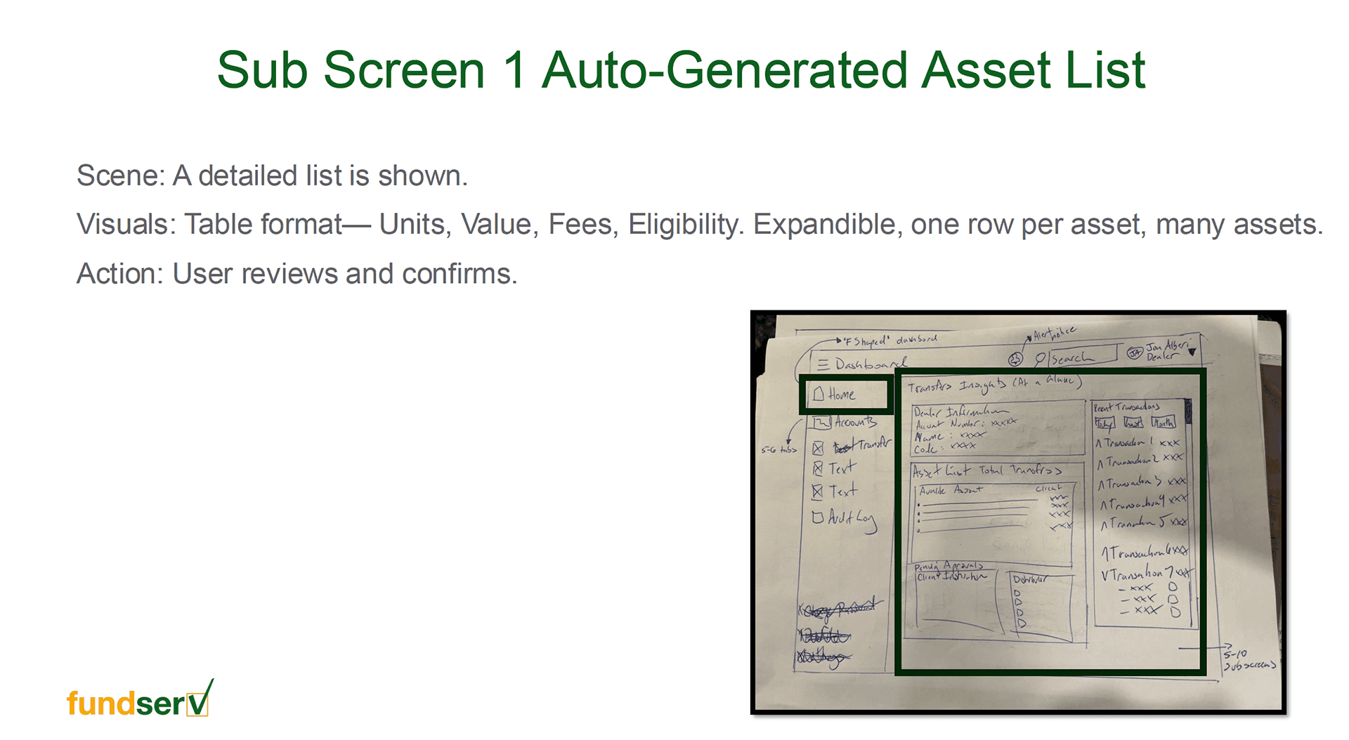
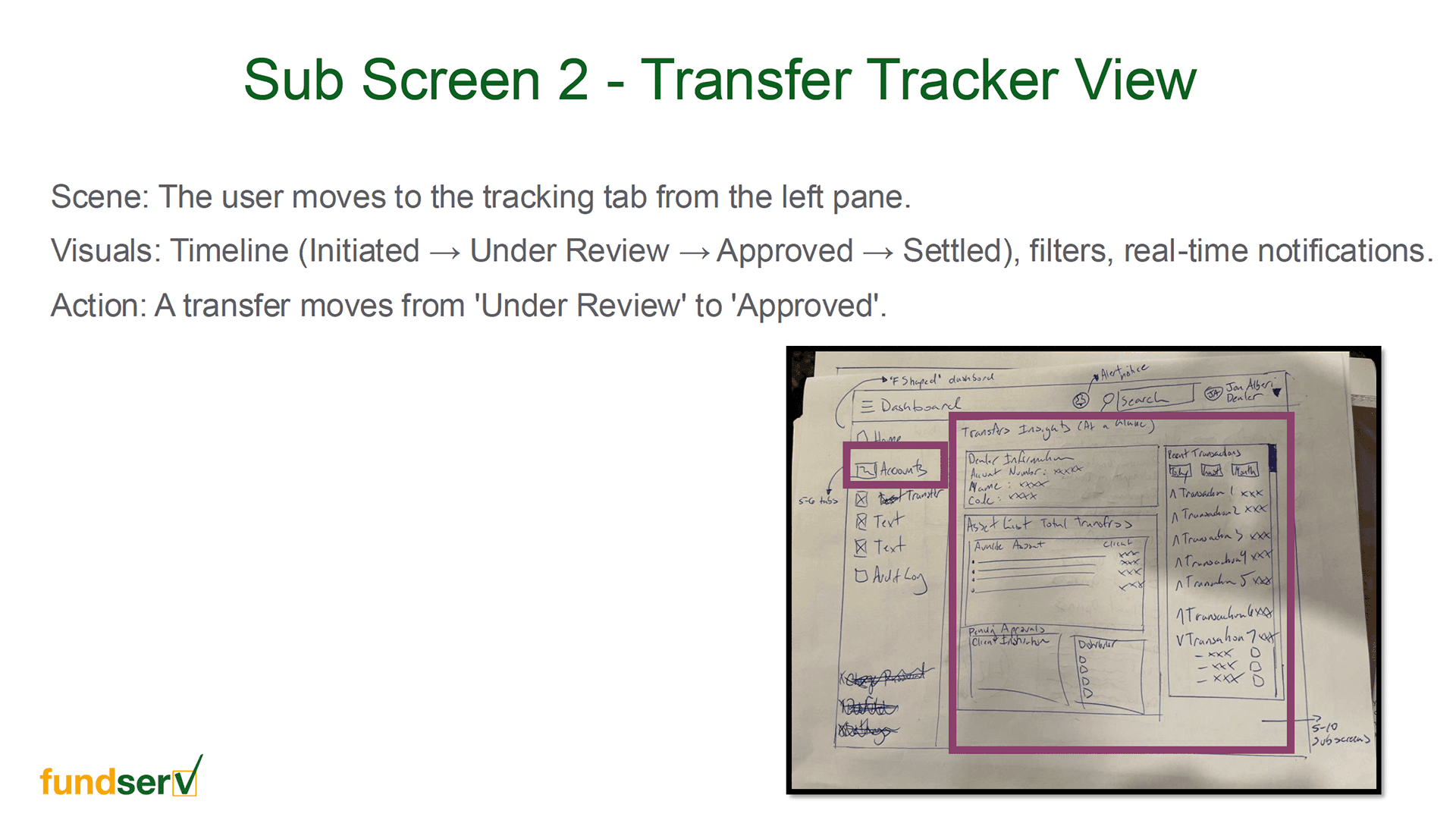
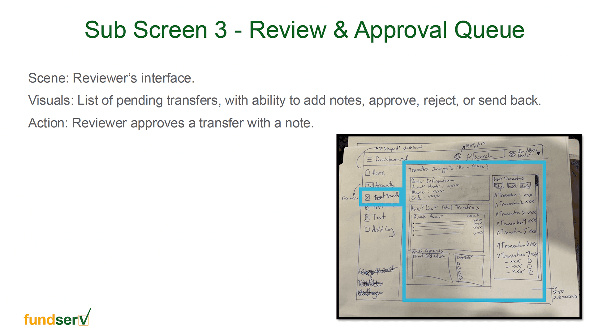
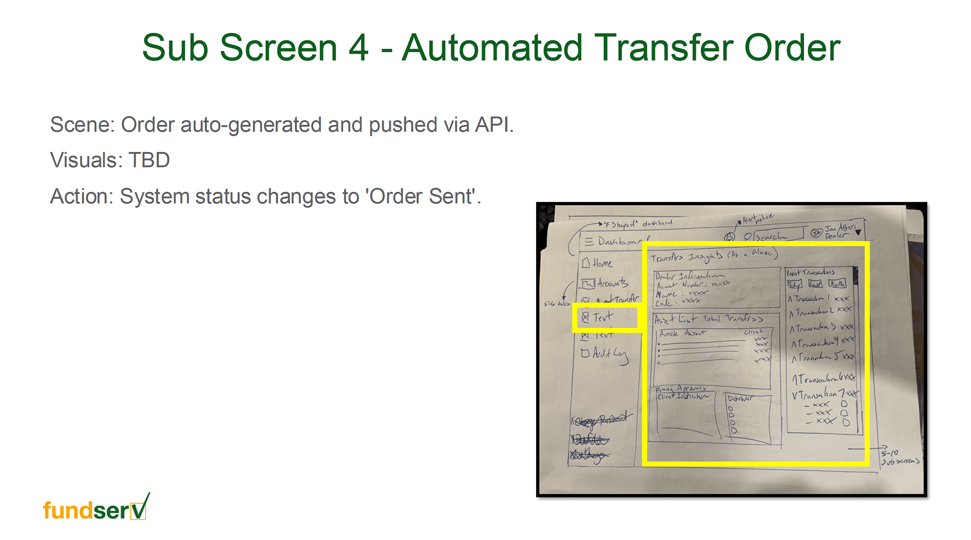
Low-fidelity Sketches
Before touching any design tool, I put pen to paper. These early sketches were about exploring structure and layout quickly, trying out different ways to present transfer requests, status updates, and approval flows without getting caught up in details. Fast, rough, and intentional.
Final Solution


Usability Test
Once the prototype was ready, we wanted to see it in the hands of real people before calling it done. We gathered 6 participants, operations managers and transfer specialists from banks and fund companies across Canada, and walked them through the core tasks they'd encounter on the platform day to day.
Task 1 : Create a Transfer Request Users complete a 4-page form to initiate a transfer
✅ All 6 users completed the task successfully
✅ The step-by-step form structure felt intuitive, breaking it into pages reduced overwhelm
⚠️ 2 users paused on page 3, unsure whether all fields were mandatory
🔧 Fix: Added clearer field validation and required field indicators
Task 2 : Review, Approve & Send to the Other Dealer Both dealers review their side and pass the request along
✅ 5 out of 6 users completed the handoff without guidance
✅ Both dealer roles understood their responsibilities within the flow
⚠️ 3 users hesitated on the send/approve button — labels weren't explicit enough about what would happen next
🔧 Fix: Renamed action buttons to be more descriptive and added a confirmation step
Task 3 : Asset List Exchange Receiving dealer requests the list, both sides fill their parts, Relinquishing dealer completes and closes
✅ All users followed the exchange sequence without getting lost
✅ Having the full back-and-forth in one place — rather than scattered emails — was the most praised aspect of the platform
⚠️ 2 users weren't confident their action had gone through — confirmation feedback felt too subtle
🔧 Fix: Made success states more prominent and reassuring
Overall
94% overall task completion rate across all sessions
100% of participants said the platform was a clear improvement over the current process
The core structure required no major redesign — only targeted refinements based on session findings
Outcome & Reflections
The Fundserv Transfers Platform MVP set out to solve a problem that had been hiding in plain sight for years a critical financial process held together by emails, phone calls, and manual document exchanges. By the end of the project, we had something the industry hadn't seen before: a single, structured space where both dealers could manage the entire transfer lifecycle together.
What we delivered:
A unified platform serving two distinct user roles with clarity and confidence
A digitized end-to-end transfer workflow, from request creation to final approval
A validated, tested MVP ready for development handoff
What we learned:
Clarity beats cleverness. In a regulated, high-stakes environment, users don't want to figure things out, they want to be guided. Every label, button, and confirmation message carries weight.
Designing for two roles simultaneously is a balancing act. What simplifies the experience for one dealer can create confusion for the other. Keeping both perspectives in the room at all times was essential.
Testing with real stakeholders changes everything. The usability study didn't just validate the design, it built trust. Having the people who will actually use the platform involved in shaping it made the final product stronger and the stakeholder buy-in much easier.
Next Steps
This was an MVP, intentionally scoped to prove the concept and get it into users' hands. With a validated foundation in place, the natural next steps would be:
Expanding the asset list functionality, adding bulk actions, filtering, and error handling for edge cases
Notifications & reminders, proactively alerting dealers when action is needed on their end to prevent transfers from stalling
Reporting & audit trail, giving compliance teams visibility into the full history of every transfer
Onboarding flow, as the platform scales to more member institutions, a guided first-time experience will be key to adoption